

What if online therapy can provide users a simple way to take care of their mental health?
ROLE
TIMELINE
UX Designer
7 weeks
CLIENT
Mind Mural Therapy
TOOLS
Figma
Zoom
Unlearning is the highest form of learning.
Therapy, a form of treatment that addresses an individual’s emotional distress and mental health concerns, is a tool utilized heavily by individuals aiming to improve their well-being. Though a wide range in types of therapy exist, Trauma-informed therapy, which focuses on helping an individual cope with emotional responses caused by traumatic events, isn’t as common, but should be more talked about.
Your mind is an art piece.
This is what my client, the CEO of Mind Mural Therapy, stated when asked what inspired her to start her own private practice. Mind Mural Therapy aims to launch an inclusive and culturally sensitive platform that provides teletherapy services and psycho education around mental health awareness. For the next 7 weeks, I journeyed to design a responsive website that prioritizes users’ concerns of easily navigating an online therapy platform with a smooth booking flow.

PROBLEM
Though conversations around mental health are happening more in this day and age, not everyone is granted the same access to quality of care. Furthermore, Trauma-informed therapy is an important type of therapy that isn’t as well known compared to other forms.
GOAL
Design a responsive website app that connects users to the online therapy services that Mind Mural Therapy has to offer.
SOLUTION
A platform that gives users a seamless experience learning about different forms of therapy and signing up for a free consultation.

Step 1 of our journey…
Coming from a counseling background, I was thrilled to work alongside my client in developing designs for her private practice. I found it intriguing to know the back story behind her company’s brand name, curious about the inception of “Mind Mural Therapy”.
“I was inspired by an art piece of a brain with flowers growing in it. That’s how “Mind Mural Therapy” came to me.Your mind is your art piece.”
-Prarthita Jain, CEO of Mind Mural Therapy
My client expressed interest in bringing her platform to India, but wanted its initial launch to be in New York City, her location of License Certification. When asked the goals of the platform she wanted to create, my client mentioned:
“I want this platform to be trauma focused, culturally aware, culturally sensitive, providing as much inclusive care as possible, all while raising the user’s awareness around mental health.”
Who are we up against?
Whilst performing my competitive analysis, I felt it best to involve therapy platforms that existed in and out of New York State.
-

Millenial Life Counseling
Online and in-person therapy platform based in Texas that specializes in Individual and Couple’s counseling
STRENGTHS
• Step by step segment in landing page
• Booking page has step-to-step from choosing clinician, to selecting service, location, time, client, contact info
WEAKNESSES
• Doesn’t take insurance
-

Embodied Mind NYC
New York based Therapy platform that provides both therapy services and training services to users..
STRENGTHS
• Training opportunities for students and mental health professionals
• Fully staffed (13 team members)
• Provides several form of treatments
WEAKNESSES
• FAQ page doesn’t answer too much, user would likely have to reach out to get questions answered
• No insurance coverage, only out of network
-

Human Told
New York based therapy service that helps users find the right clinician and care for mental health service.
STRENGTHS
• Hosts workshops
• Provides several form of therapy
• External links to youtube videos
WEAKNESSES
• No FAQ page, users may have to contact directly for any unanswered questions
-

Mindwell NYC
New York based therapy service that prioritizes connecting clients to the therapy service and clinician that best suits them.
STRENGTHS
• Separate sections for the different types of people they treat
• Different forms of therapy provided
• Several different sections/ tabs for user to navigate website
• Personalized intake process
WEAKNESSES
• No testimonials
Key takeaways
After conducting my competitive analysis, I found the following key insights to be the significant areas to consider before creating a solution:
Is it a good match?: Multiple companies prioritized connecting users to the right clinician and service that best suits them. Since not every therapist is a one-size-fits-all solution, it would be important for the user to know what they''d be getting into before committing,
What if I have questions?: It’s a given that a company won’t be able to foresee all the questions a user may have when it comes to their service, so it’s important to have a Frequently Asked Questions section, especially if the company doesn’t provide a quick and easy way to contact them.
How much is it going to cost?: Most companies did not provide a price for their their session costs, while others didn’t take insurance. Though I can understand why these services wouldn’t want to scare their clients away with the potential high pricing, I’m curious to see whether this would deter the user away from taking advantage of the services provided.
How do we know if the services are any good? Just like how users rely on reviews to tell if a product is worth purchasing on an e-commerce platform, they’d likely want to see something similar on a therapy site, whether it be through reviews or testimonials.
Our Audience
I wanted to hear from other users firsthand with the goal of learning their previous experiences in therapy, reasons for wanting to start therapy for the first time, challenges in booking appointments, and positives in the booking process. I interviewed a total of six participants (3 female, 3 male), all in their 20’s-30’s who have either gone to therapy or are interested in starting.
200+ data points to 6 themes…
The following insights were found when creating my affinity map following the user interviews:
4/6 participants want to be able to easily identify the therapist’s speciality and background experience
SPECIALITY AND BACKGROUND
5/6 participants rely on reviews and testimonials to determine how reputable a therapist is.
RELIANCE ON REVIEWS
SIMPLE BOOKING PROCESS
4/6 participants would appreciate a smooth booking process
3/6 participants prefer to see the quote or cost of sessions and what insurance the therapist takes up front.
COST TRANSPARENCY
3/6 users expressed difficulty navigating the site to booking an appointment and frustrations in a tedious onboarding process
EASE OF NAVIGATION
3/6 users shared challenges of going through an entire process of booking the therapist just to find out it wouldn't’ be a good fit
FINDING THE RIGHT MATCH
Snapshot of some clusters from Affinity Map below:
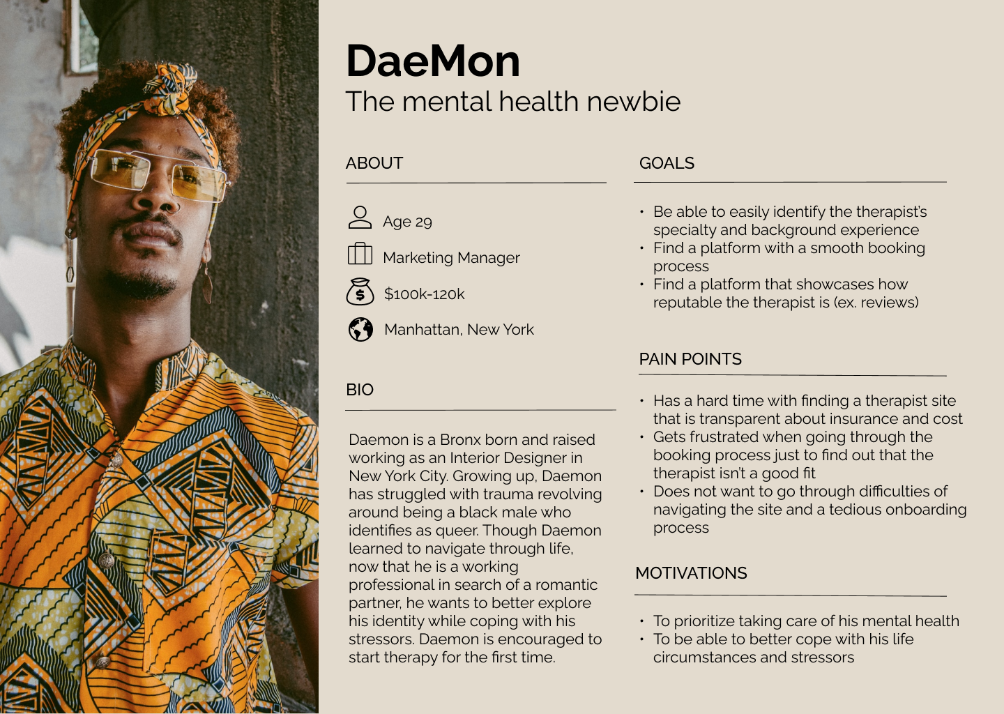
Meet DaeMon
DaeMon, a queer individual born and raised in New York City starting therapy for the first time, is a persona created to humanize the user’s therapy search experience. I’ve gathered the goals, pain points, and motivations to help guide my design making process.
What features to prioritize?
After developing my key research insights from the interviews and creating my user persona, I shared my findings with my client. Together, we decided the primary features we wanted for Mind Mural Therapy, ones that would best cater to Daemon’s needs.
FEATURE SET
-
My client made it clear that she was providing mandatory free consultations for all prospective clients. We also found it would be beneficial for users and herself to see whether they’d be a good fit for one another.
-
Based off of our competitive analysis and user interviews, my client and I decided to have a section dedicated to clients’ experiences working with the therapist.
-
Sections will be divided into separate pages, an “About Me” page and a “Services page.”
Users will be able to access the therapist’s education, background, specialties, and services offered.
-
Initially, my client was hesitant on being upfront about her session costs due to worries of discouraging users to book with her due to potential high pricing.
However, after going over our user feedback and interviews, we decided to take the plunge and add that layer of transparency.
Go with the user flow
My client and I knew we were running on limited timeline, so which user flows were most important to prioritize? We stepped into the POV of Daemon, someone who was starting therapy for the first time. If we were Daemon, we’d first want to see what services were provided at Mind Mural Therapy:
“Daemon wants to see the type of services offered at Mind Mural Therapy.”
Now that Daemon is aware of the services provided, he’d likely want to figure out whether or not he could afford the services offered at Mind Mural Therapy:
“Daemon wants to find out whether or not Mind Mural Therapy accepts his insurance.”
Daemon is now confident that Mind Mural Therapy has the service he desires and takes his insurance, making it affordable. He would. now likely want to book a consultation with the therapist to see if they’d be a good fit:
“Daemon wants to book a free consultation with Mind Mural Therapy.”
At the drawing board
Sketching the low-fidelity wireframes allowed me to envision the overall structure of the Mind Mural Therapy Site and placements of components. This step also helped me determine the potential number of screens to design.
Let’s turn it up notch
Digitalizing my wireframes to mid-fidelity screens allowed me to provide more detail such as text and layers.
Who is Mind Mural Therapy?
Creating the brand’s identity is probably the step I had the most fun with. To start off, I took a look at the Circler’s core values:
Warmth, Safety, Curiosity, Inclusivity
Wanting to incorporate her her back story of finding inspiration behind the brain and flowers art piece, I suggested adding elements of that art piece into her logo:

We agreed that we would keep the full name “Mind Mural Therapy” in both the desktop and mobile version of the logo. After playing around with a couple of sketches, I came up with the final digitalized design:
OFFICIAL COMPANY LOGO

STYLE TILE

Let’s kick it into high gear
When it came to designing the high-fidelity screens incorporating the color palette and style tile, I kept the users’ needs in mind when it came to designing the primary features of the site. Some iterations made from the mid-fidelity wireframes included reducing the number of screens from the free consultation booking flow, and being more selective with the amount of white space.
A responsive site with a no-frills landing page

I kept in mind the users this platform would be attracting, some of whom may be in distress when seeking help. Therefore, it was pivotal for me to make sure the landing page was simple, to the point, yet informational.
The landing page immediately dives into the therapist that the potential client will be working alongside with, followed by the services offered, core values, and testimonials.
The user has the option to learn more about each section by clicking on the navigation links at the header or the “learn more” buttons under each segment
Extensive overview of services offered and therapist’s specialities and background


It’s vital for the user to know what they are getting into and whom with when it comes to seeking mental professional health. Separate pages were created for “About Me” and “Services”
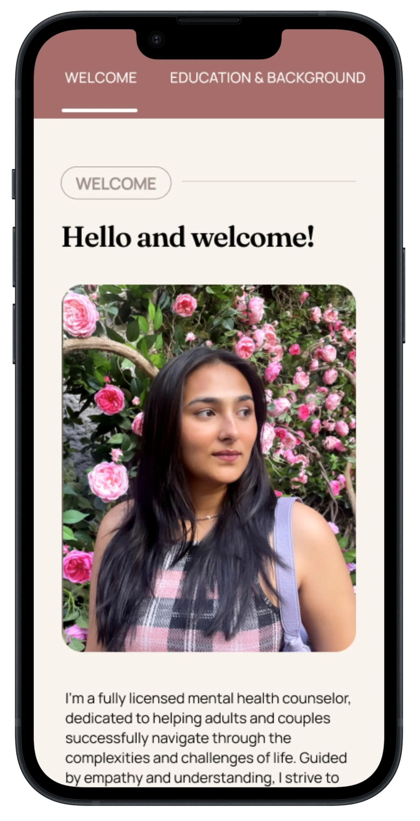
The “About me” page was probably one of the most challenging to tackle. Because this was the one space she would be able to introduce herself, her back story, and all she had to offer, we felt it was necessary to include a majority of information given. I made the design decision to separate the following sections into tabs: Welcome, Education and Background, Specialties, Therapeutic Approach, and Story behind “Mind Mural Therapy”. This way the user wouldn’t feel overwhelmed with all the information given on one page.
The services page includes a short segment of the counseling services. provided and a link to learn more, leading the user to separate pages.
Transparency on insurances and pricing

Most users mentioned pain points in finding therapy websites that were up-front about their session costs and the insurance they’d take. My client was initially against making her fees public, but after going through user feedback, we decided to take the chance.
Insurance page provides insurance partners that Mind Mural Therapy is in-network with, and costs of sessions out of network.

Seamless and Smooth booking process

Since the booking process was going to be the most dynamic flow I was designing, I had consider a lot of factors that would ensure a straightforward, non-tedious process for the user. My client and I agreed that we would minimize the number of screens in this flow to avoid overwhelming the user.
Designed screens with a progress wizard, showing users where they are in their booking process.
Applied straightforward directions, with text copy containing just the necessary details
How well does our product work?
I conducted usability tests on five participants to gauge how easily they were able to successfully complete three separate tasks.
Testing was moderated in 30-45 minute time frames, both person and through Zoom screen share with Figma Prototype Mode.
⮕
Task 1
Navigating to the Individual Counseling Page
Task 2
Navigating to insurance page
⮕
⮕
Task 3
Booking a free consultation
Measuring Success
The following metrics were used to measure success in testing my prototoype:
Asked users to rate each task on an scale of 1 (easy) to 3 (difficult)
Asked users to think aloud while completing tasks to identify thought process
Whether the user successfully completed the task
Number of errors that occurred while users were completing the task.
100%
of participants completed all three tasks successfully
1 of 5
participants made a total of 0 errors.
3 of 5
of participants rated all three tasks a 1 (easy)
To gauge next steps, I created a feedback grid that allowed me to visually take note of key insights from the usability testing and separated them into categories: What worked, what needs to change, any questions asked, and ideas.
I then sorted common feedback notes into a chart that that ranged on severity and frequency.
Key Insights
Most users initially clicked on “FAQ” to find the insurance page. “Fees” was the second option most users went with, but wasn’t obvious enough for them to click the first time.
Users found the “About Me” page not as intuitive to navigate due to the sections only being accessible through the separate tabs. Most users preferred the information to be displayed on one page.
Users would appreciate a note on confidentiality in the free consultaiton form, especially since they’e giving out quite a bit of information.
The “Select Service” page confused most users since they layout makes it seem as if they are receiving that service during the consultation.
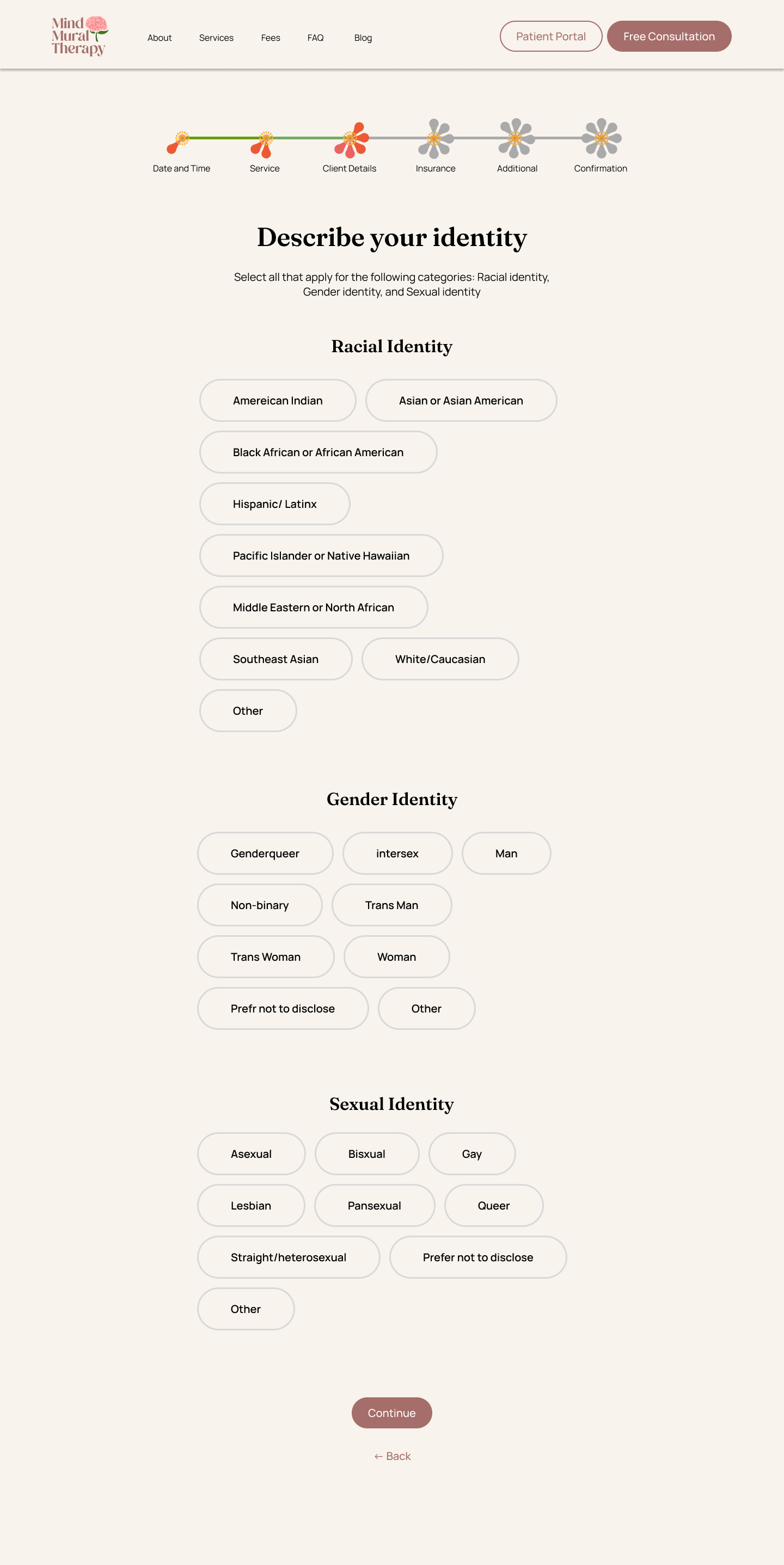
The “Identity” page involved too much scrolling, users preferred a condensed version and suggested either a dropdown, radio buttons, etc.
Users would like to see some form of detail overview before clicking “submit form” on the free consultation form.
Design Iterations

BEFORE
“Fees” wasn’t intuitive enough for users to click on when accessing insurance information. Users wanted easy access to contact the clinic.

AFTER
Changed “Fees” to “Insurance/Fees” and added a navigation link for “Contact”

BEFORE

Original “About Me” had sections accessible in different tabs depending on what the users wanted information on.

AFTER
Allowed “about me” info to be scrollable but made tabs “sticky scroll” at the top that way user can access different sections by clicking on the respective tabs.

BEFORE
Some users felt that there should be some type of copy saying that information will be confidential

AFTER
Added a blurb about what the free consultation entails to avoid confusion. Also added confidentiality statement

BEFORE
Users were confused as to whether selecting the service would mean that they will be receiving the service in the consultation.

AFTER
Got rid of the time and added a “NOTE” disclaimer, so users will read that they will not be receiving that service during the consultation
BEFORE
Users were confused as to whether selecting the service would mean that they will be receiving the service in the consultation.
AFTER

Got rid of the time and added a “NOTE” disclaimer, so users will read that they will not be receiving that service during the consultation. Also added time stamp at bottom of each screen as a reminder for the selected appointment date and time.


And Now, for the Grand Finale
Introducing
Mind Mural Therapy

With our designs are finalized, we are ready to take our users on a journey to a seamless, smooth way to start therapy.
Next Steps
What’s in store for Mind Mural Therapy?
With the designs handed off to my client, Mind Mural Therapy is now in production of launching their site. My client is in the works of creating a site that tailors to both residents of New York State and India.
This project’s primary focus was to create a minimum viable product. If given the opportunity to improve the user experience, I would do so by adding the following features:
BLOG AND WORKSHOPS
Designing an area for blogs and workshops would be a goal my client would eventually want to have. Once her practice expands, she’d like to host workshops and write articles to share on her site.
PSYCHO-EDUCATION
A feature that my client and I felt was important, but not necessary in the early stages of design was having a psycho-education aspect to the site. We believe users would benefit from getting a more in-depth learning experience about the type of therapy my client specializes in.
LIVE-CHAT OR INSTANT MESSAGE
This is likely a feature that would be developed in the far future when my client has a team of people she were working with. Users would be able to get a quick response to any questions they’d have.